
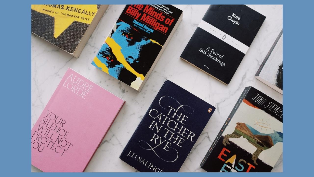
Some of the biggest headaches seem to be caused by book covers.
I’ve had a lot of questions recently regarding book covers. Something that should be simple can quickly turn into a difficult task and cause all kinds of headaches. In this blog post I would like to address some of the problems that people have mentioned to me.
My covers don’t look as vibrant in Amazon’s thumbnails as on my design. Why?
This is a questions that has popped up so many times and a lot of advice has been given regarding RGB vs CMYK colour spacing. RGB is the color space used for on-screen images, while CMYK is the color space that printing devices can capture. As a basic explanation, the RGB (red, green, blue) images look brighter because they are being shown on a lit screen. It’s hard to achieve the same brightness with ink on paper. For eBooks on Kindle, Amazon will always use RGB, as they are viewed on a screen. If they are provided in CMYK, Kindle will automatically convert the images to RGB.
What about for printed books?
All printing is done in CMYK, the colour space based on the four colours cyan, magenta, yellow and black. Depending on the software you use to create your designs, you should set the colour spacing to CMYK. If you use Canva, download your designs as Print PDF. If you still feel you need to do more, you can even use an online converter that coverts your images from RGB to CMYK colour space for free. This one is good: rgb2cmyk.org. Right at the bottom of the pages you can find a way to convert all RBG images in a PDF to CMYK: pdf2cmyk.com. Now you’re good to go.
But wait! My covers still look less vibrant on Amazon’s thumbnail than on my design!
That is because your problem likely had nothing to do with the RGB or CMYK setting! I know some people stress about the colour settings. That’s probably because they have a background in design and know that the correct settings are important when it comes to printing. However, when it comes to creating books on Amazon, the difference in tone is minimal, it’s not something that a buyer would even notice. And in addition, Amazon uses different printers, so your printed books will always look slightly different depending on the printer.
The reason your cover looks faded or less vibrant in the preview or the thumbnail is because Amazon compresses the picture. If Amazon used the high resolution image, their site would take a long time to load. So in order for the site to load quickly, the images are compressed. This means they do not look like your design in Canva, Affinity or any other software you use. However, your printed books will look like your design. This is the very simple reason your covers can look faded in the thumbnails and preview. It’s not something that you can change.
What about those white lines that I see in the preview?
When you upload a cover or interior to Amazon KDP, there have been times when the designs show thin whilte lines across the image. Most think that this is a fault in Canva but this can happen in other design software too. The white lines are due to the image not being flattened before saving. Your design most likely consists of different elements put together on one page and the lines are where the different elements meet. Flattening your pdf will get rid of this problem.
How do I flatten my PDFs?
An easy way to flatten your design, if you’re using Canva, is to download your design as a png. Then upload it again to Canva and then download again as PDF Print. (Seems like there should be an easier way!) This will flatten your design. That was the workaround I used to suggest that solves the problem. However, if you want to flatten your whole interior, that would involve a lot of messing around. I just found a much easier way: go to Google and search for ‘flatten pdf online free’ and you will find several places where you can just upload your pdf file, the tool will flatten it and then it is ready for you to upload to KDP. So much easier! You’re now good to go!
Do I choose Bleed or no Bleed for covers?
I have seen some people being very confused by bleed. The thing to remember is that you only have to choose bleed or no bleed for your interiors. The covers are ALWAYS bleed, automatically. That is because most covers have designs that go all the way to the edges and cover the whole book. With interiors it could vary, some designs will not go to the edge of the paper and then you can choose ‘no bleed’.
So just remember that covers are automatically always ‘with bleed’.
If you have any further questions about covers, feel free to pop them down below and I will do my best to answer them here or cover your question in a future video.

*This post may contain affiliate links.
1 Comment on Your Book Cover Problems Answered
Comments are closed.
Great post. I find book covers to be tough to create and design manually. I like employing the use of Canva, Lulu, and Gimp to create mine. The farthest I’ve gone to getting one professionally done was from a designer on Freelancer.